Picking the right colors for your user interface elements is always a great challenge, but it is even more challenging when you develop reusable framework controls where you as a developer have no control over the look and feel of the application using them. While you might always add elements on top of the default gray background the developers embedding your controls might have more of a gothic tendency and use a black background. All of a sudden the nice colors your picked clash with the rest of the application.
To tackle this problem the best way I found while working on FlexGanttFX and FlexCalendarFX was to use semi-transparent colors. When you do the color of your UI elements will always be a mix of their own color and the background color. Your colors will become brighter if the application uses a white background and darker if it is using a black background. The contrast between your element and the background will never be strong, which makes for a smooth appearance.
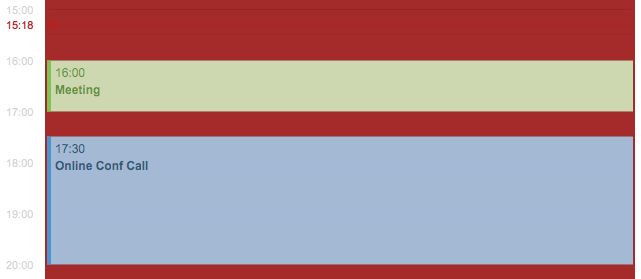
The following screenshots were taken from FlexCalendarFX (work-in-progress).

Same UI now with a darker background. You might not see it at first, but the green and blue are actually different between these two screenshots. These are very subtle differences, but they make a big difference in the overall impression of your application.
In JavaFX you can define colors in CSS with an alpha channel value smaller than 1 to achieve transparency:
.my-style {
    -fx-background-color: rgba(255, 255, 255, .7); // transparent white
}
Using opacity also has the nice side-effect that you can still distinguish different elements even when they overlap each other.
[…] notice that the base color is using transparency as described in my previous blog about transparent colors. The other background colors in this CSS fragment are all derived from the base color. They are […]
I feel exactly like you regarding transparency, or translucency as some like to call it. One should however know that if a transparent shape is printed, some printer drivers will revert to pixel based printing.
This will make the output slightly pixelated but more importantly the spool file will be HUGE. A print that take 10s without transparency might take three minutes if there’s a single print command with transparency.
This happens for some printers, mostly more expensive ones (my experience) for some reason… At least this was the case for Swing though I don’t think it’s Swing’s fault and it’s probably more a diver simplification.
So, just a heads up that one might need a backup color palette if the calendar will be printed.