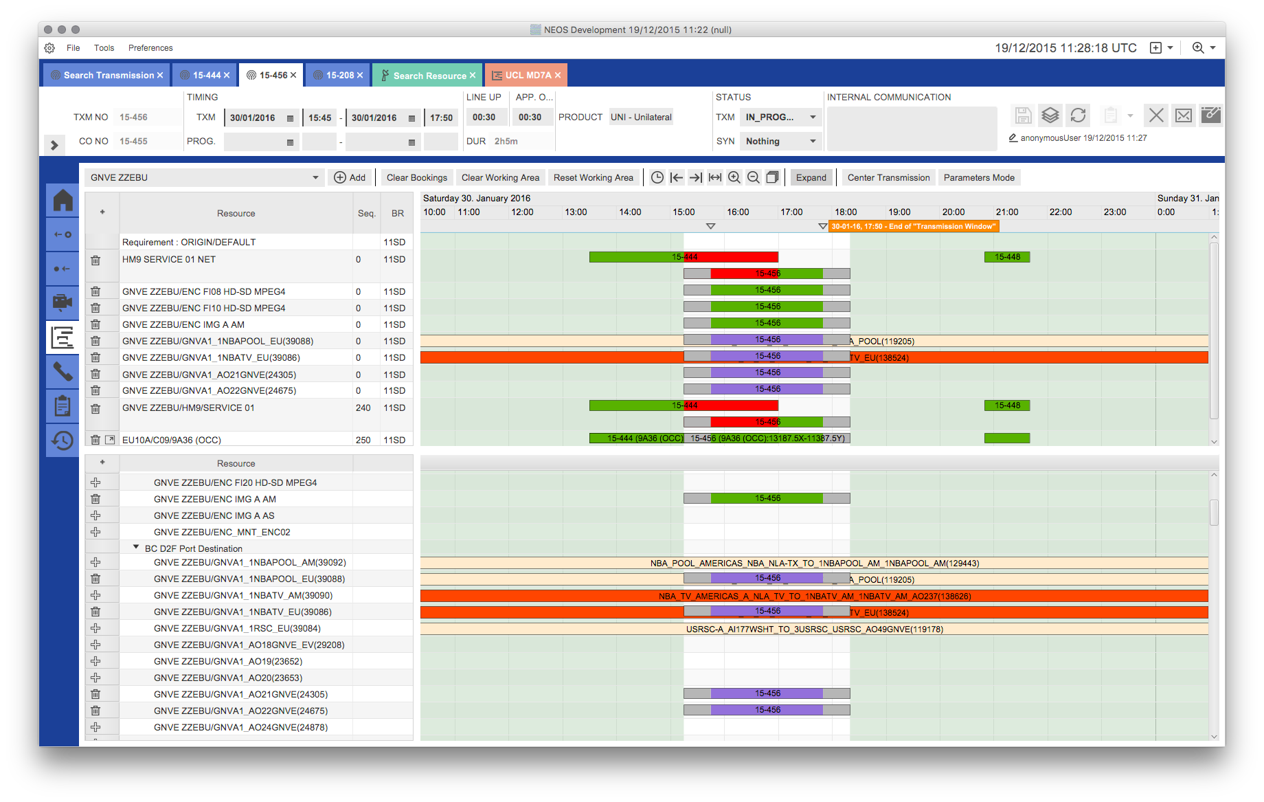
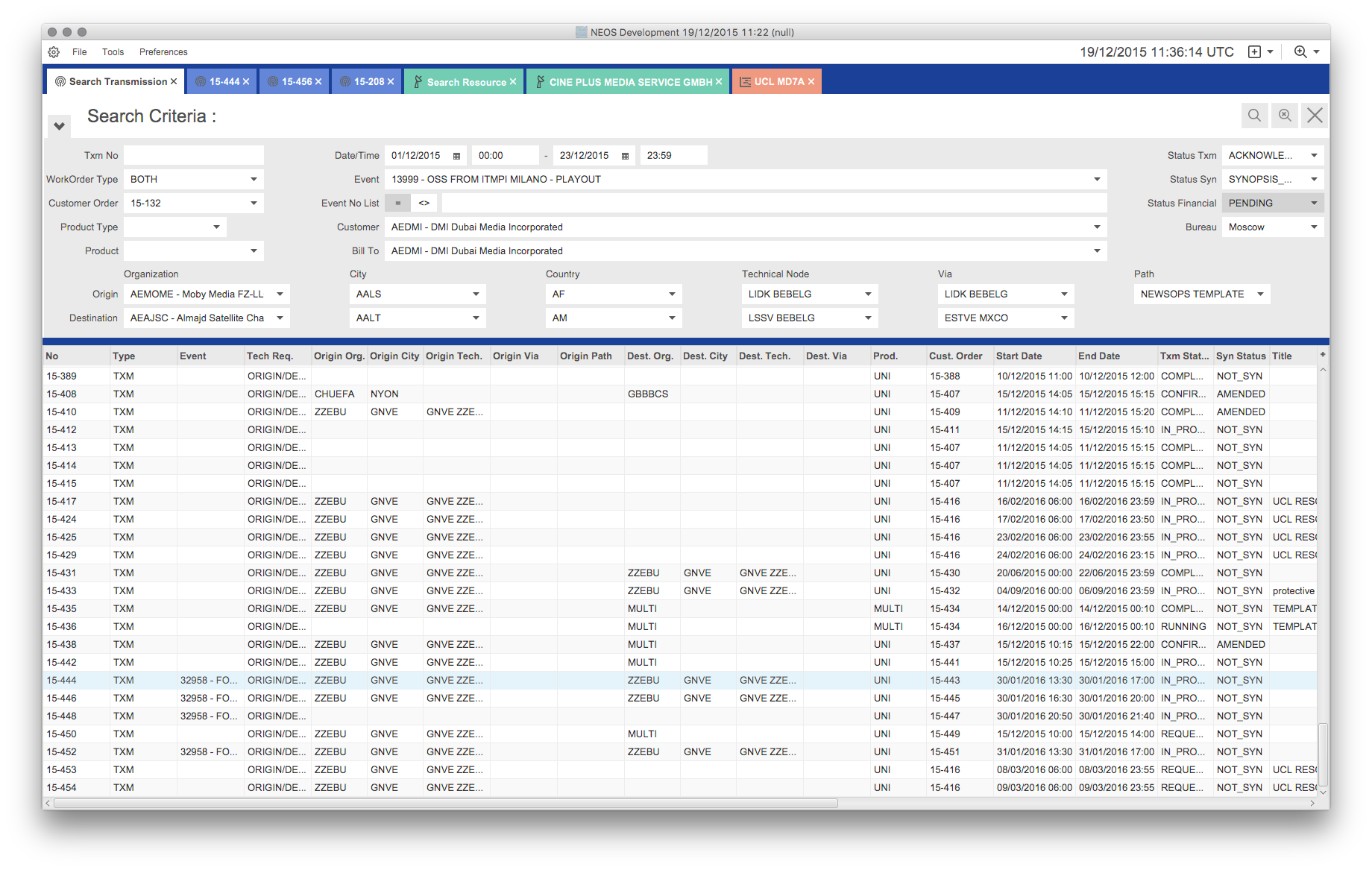
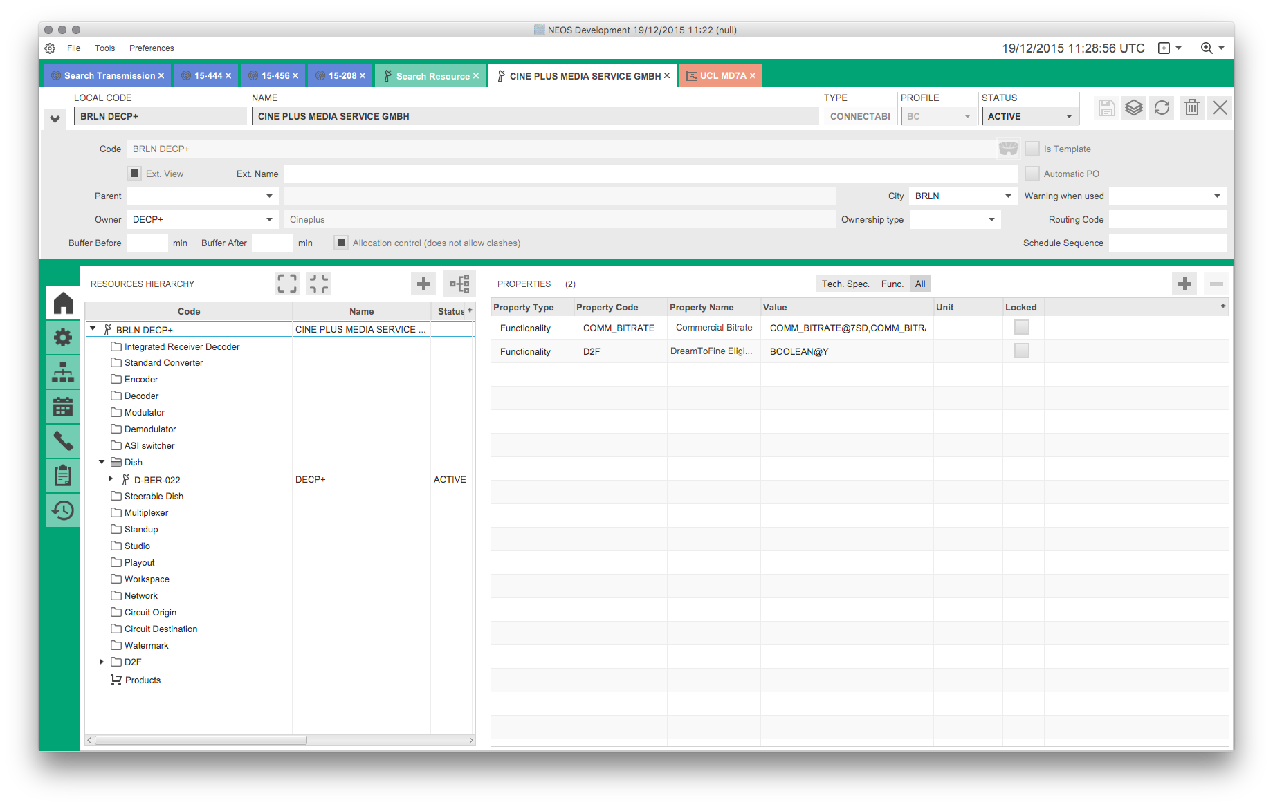
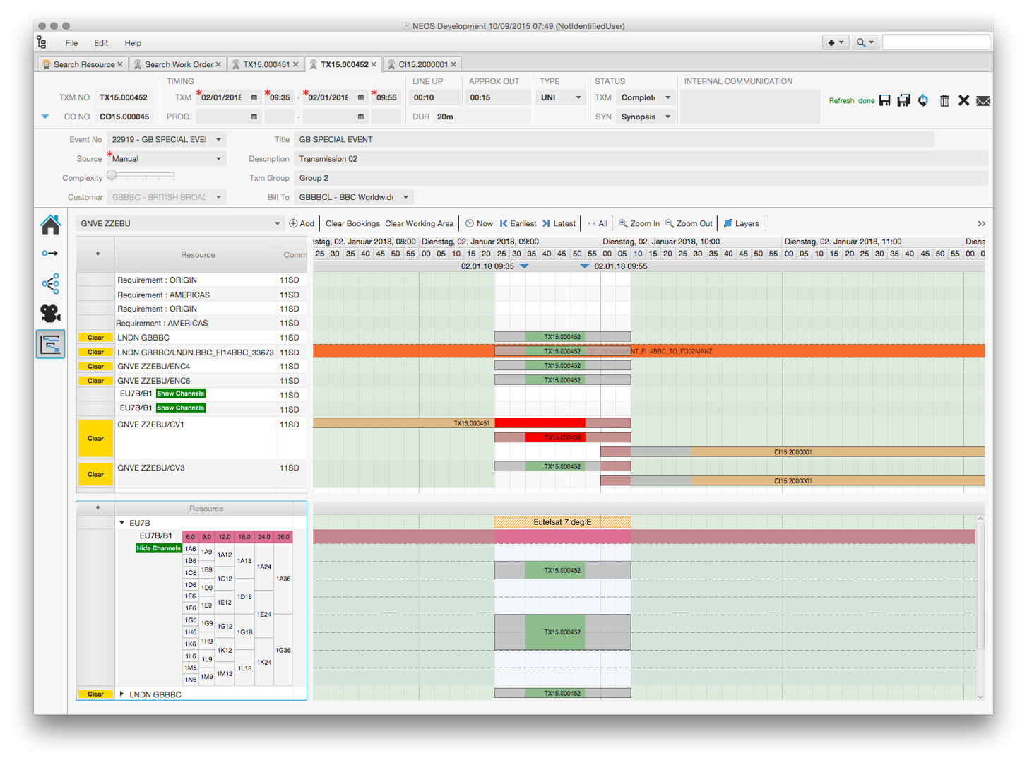
I recently presented the NEOS application that was developed for the European Broadcasting Union. Now that a few weeks have passed the UI has been polished and a lot of work was invested into styling it via the CSS support of JavaFX. I really like the results and thought it would be good to show you.


Nice looking indeed, good job! So you only worked on the CSS to get to this result, right? Still early learner on JavaFX, but looking at this, I see there is potential to get to good looking results.
Yes, this is all CSS, no extra controls.
[…] Lemmermann has posted about the power of CSS in JavaFX. He has also created a YouTube playlist of JavaFX applications in the ‘real world’. […]
Nice work, but there are some other things that jump into my face 😀
look at the second screenshot
Space between inputfield from Txm No and WorkOrder Type are not the same like the rest
also the Calnder Picker next to Date/Time have not he same high like the rest of the input fields.
Just small things but for me there are big as hell 😀 😉
And I agree with you Garog, but these issues are not directly CSS-related but layout problems that the developers must have missed.
I just want to add this, i wrote that because of “PIXEL PERFECT – Where pixels have a home” 😉
Have you altred FXML or layout in code, if FXML wasn’t used, or it’s reqlly just CSS?
Like controls positions.
This is all CSS … or do you see any controls that are in a different location now?
Tabs on the left are on different locations, and there are more of them. But general controls are the same, I was confused that there are different count of screenshots.
[…] Lemmermann has posted about the power of CSS in JavaFX. He has also created a YouTube playlist of JavaFX applications in the ‘real world’. […]