I just finished a two month sprint on advancing CalendarFX and getting it ready for release 8.4.0. One focus of this sprint was on performance. There are many things that can influence performance but when it comes to JavaFX the number of nodes in your scenegraph and CSS styling are top candidates for optimisation. After reviewing the custom controls that ship with CalendarFX I realized that many of them used a lot of nested panes (BorderPane, VBox, HBox, GridPane) in order to achieve a specific layout. Nested panes result in a high node count and complex CSS styling instructions.
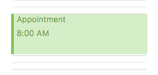
One simple example are the views that CalendarFX creates to visualize calendar entries in the DayView control. This control shows the 24 hours of a day vertically and places DayEntryView instances on them. These entry views look like this:

In the previous releases of CalendarFX the skin of the entry view used a VBox instance to lay out the two labels that show the title of the entry and its start time. That was the only purpose of the VBox. Doesn’t sound like a big issue but when your application starts to show hundreds of those entries then you end up creating hundreds of VBox instances, too.
The way to avoid this is to mange the positioning of these labels yourself and to implement / override the layoutChildren() method of the skin. Not only do we save one node but it also gives us more flexibility. We can now decide to hide or show the labels based on the available space. In the case of the DayEntryView we can decide to hide the start time label if the available height of the view is not big enough to show both labels. This kind of, may I dare to say it, “responsiveness” is not possible when using the out-of-the-box layout panes that are shipping with JavaFX.
The code of the layoutChildren() method of DayEntryViewSkin can be seen below.
    @Override
    protected void layoutChildren(
                               double contentX,
                               double contentY,
                               double contentWidth,
                               double contentHeight) {

        // Title label.
        double titleHeight = titleLabel.prefHeight(contentWidth);

        // It is guaranteed that we have enough height to display
        // the title (because "computeMinHeight" returns the min
        // height of the title label).

        titleLabel.resizeRelocate(
                snapPosition(contentX),
                snapPosition(contentY),
                snapSize(contentWidth),
                snapSize(titleHeight));

        // Start time label (only show it when there is enough space).

        double timeLabelHeight =
                           startTimeLabel.prefHeight(contentWidth);

        if (contentHeight - titleHeight > timeLabelHeight) {

            // make sure to set visibility to true again
            startTimeLabel.setVisible(true);

            startTimeLabel.resizeRelocate(
                    snapPosition(contentX),
                    snapPosition(contentY + titleHeight),
                    snapSize(contentWidth),
                    snapSize(timeLabelHeight));

        } else {
            // Not enough space, hide the start time label.
            startTimeLabel.setVisible(false);
        }
    }
The nice thing about the layoutChildren() method is that it tells you exactly which space it is that your children nodes can use. The space is given by the four parameters contentX, contentY, contentWidth, and contentHeight. So there is no need to first lookup things like insets or padding. The “content” rectangle is the space that is available to you.
The second nice thing when writing your own layoutChildren() method is that you can utilize the snapXYZ() methods provided by the SkinBase superclass. These methods ensure that the child nodes will be sized and placed in such a way that they will appear crisp and not blurry. Why is this needed? Because JavaFX uses double precision coordinates to place nodes and unfortunately “int” coordinates are actually located between pixels on your display. So the snapPosition() method might take your x / y coordinate of 100 / 100 and change it to 100.5 / 100.5.
As mentioned before, the DayEntryView is a simple example. Obviously you can also create very complex layouts by overriding the layoutChildren() method. Did I always do this in the current release of CalendarFX? No, I did not. Very often I exchanged all those nested panes with instances of type GridPane, which does give you a lot of layout options but unfortunately no support for responsiveness.
Hope this has been helpful for some of you.
Happy coding!

Leave A Comment